Mobile
The editor adapts to small screens and touch on its own — a compact palette, an inspector that opens as a drag-to-resize bottom sheet, and touch-sized targets. Here's what changes and the little you need to do.
The editor runs on a phone and in a narrow embed without a separate mobile build.
It watches its own size and rearranges itself — the palette collapses, the config
panel becomes a drawer, and touch targets grow — so the same createWorkflowEditor
call works whether it’s filling a desktop screen or sitting in a phone-width column.
This page is what to expect when it gets small, and the one thing you need to set
up for it.
It adapts to its own width, not the screen’s
The editor measures itself, not the browser window. A 700px-wide embed on a big desktop monitor gets the same compact layout a phone would, because what matters is how much room the editor has — not how much room the page has. This is what lets a preview embed look right anywhere you drop it.
So everything below is keyed to the editor’s size. As it gets narrower it passes two points: first it gets too tight for a permanent side panel, then it gets phone-sized.
A narrow editor
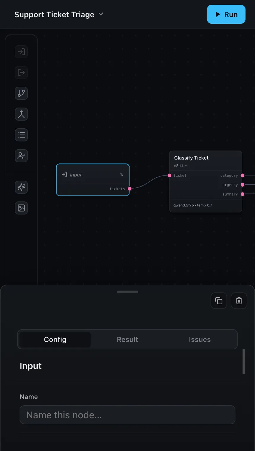
When the editor is too narrow to keep a config panel docked beside the canvas, two things change:
- The node palette collapses to a compact icon rail, so it stops eating horizontal space.
- The config panel stops being a permanent side panel. Instead it opens as an overlay only when you select a node, and closes when you’re done — the canvas keeps the full width the rest of the time.
Nothing about your code changes; this is the same editor reflowing.
On a phone
On a phone-width screen the selected-node overlay becomes a bottom sheet — the core mobile interaction, and the one to know about if you’re embedding a preview for people on their phones.
Tap a node and the sheet rises to a short peek, leaving the canvas visible above it. It carries the same Config and Result tabs as the desktop panel, so someone can run the workflow and read a node’s output without leaving the canvas. Drag it up to expand for the full detail, or pull it down to dismiss. You can drag from anywhere on the sheet — including the content, once it’s scrolled to the top — so it never depends on hitting a small handle.
The rest of the editor follows the same idea — every interaction has a touch path:
- Add a node: tap an item in the palette and it drops onto the canvas, centered in view. (On a desktop you can still drag one to place it precisely; on touch, tapping adds it and swiping scrolls the palette.)
- Connect nodes: the ports carry an enlarged, invisible touch target around the visible dot, so you can start a connection with a fingertip instead of zooming in first.
- Delete or duplicate: when the editor is editable, the bottom sheet’s header carries Delete and Duplicate buttons for the selected node.
- Dialogs — like the test-inputs prompt before a run — slide up as bottom drawers rather than centered modals.
What to get right
The editor can only measure itself if its container has a real size. Give the element you mount into a definite width and height — the editor fills it. A collapsed container (no height, or width driven by its contents) leaves it nothing to lay out against.
.editor {
  width: 100%;
  height: 100dvh; /* or any definite height */
}
And for a real mobile web page, make sure the document has a viewport tag, so phones render it at device width instead of zooming out a desktop-sized layout:
<meta name="viewport" content="width=device-width, initial-scale=1" />That's the whole setup
There’s no mobile flag to turn on and no separate component to mount. Size the container, add the viewport tag, and the editor handles the rest as it resizes.
Where next
- Editor modes —
previewmode pairs especially well with a phone embed - Layout & header — where the panels sit when there’s room for them
- Custom result rendering — control how a run’s output is displayed in the Result tab