Editor modes
The same editor, three modes — a full authoring surface, a read-only viewer, or a minimal embeddable preview. Pick the one that fits where it's going.
The editor isn’t only for building workflows. The same component can also show a
finished workflow that nobody should change, or sit embedded in a page as a tidy,
runnable preview. One option picks between these: mode. Reach for it when the
editor is going somewhere other than your authoring screen — a customer-facing
view, a read-only audit page, a marketing embed.
There are three modes, and every one of them can run a workflow. They differ in how much of the editor’s interface is on screen and whether anything can be changed.
Set the mode
Pass mode when you create the editor. It defaults to 'edit', the full
authoring experience you’ve seen so far.
createWorkflowEditor(element, { mode: 'read-only' })The values are 'edit', 'read-only', and 'preview'. The mode is set when the
editor is created — you choose it based on where the editor is going, so a
customer-facing screen mounts in 'read-only' while your builder mounts in
'edit'.
Edit
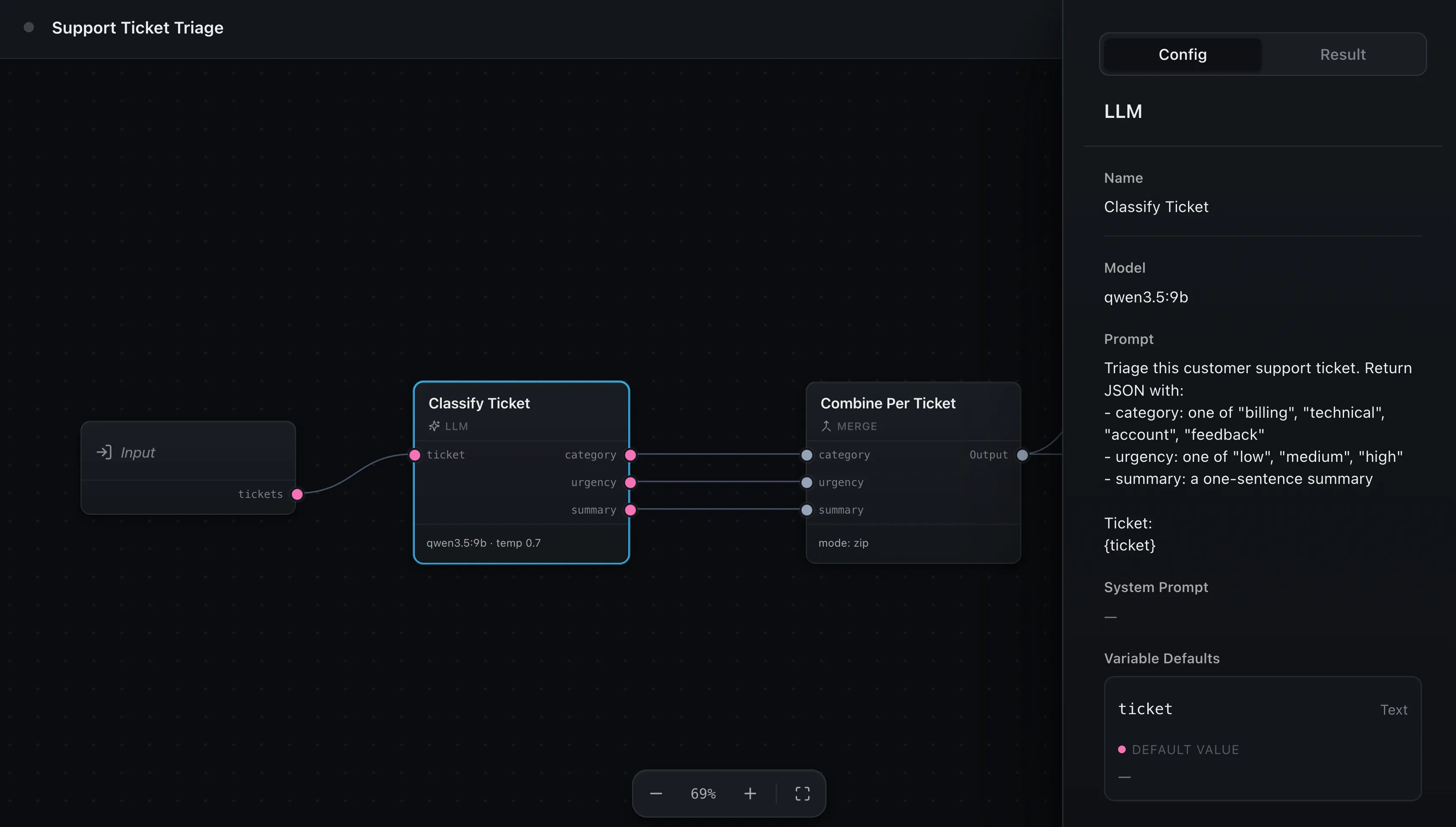
The default. The full authoring editor: the node palette on the left, an editable config panel, the Issues tab, and the complete canvas toolbar with undo and redo. This is the surface for building and changing workflows, and it’s what every other page in these docs assumes.
You don’t need to pass anything to get it — leaving mode off is the same as
mode: 'edit'.
Read-only
The same editor with nothing editable. The palette is gone, config fields become clean read-only displays instead of inputs, and the Issues tab is hidden. The canvas still pans, zooms, and fits, and nodes can still be moved around to explore the layout — but the workflow itself can’t be changed.
createWorkflowEditor(element, { mode: 'read-only' })Reach for this when someone should see a workflow without being able to touch it — a shared view of a published workflow, an audit or history screen, or a teammate who has view access but not edit access. It still runs, so a read-only viewer can execute the workflow and watch the result; it just can’t rewire it.
Preview
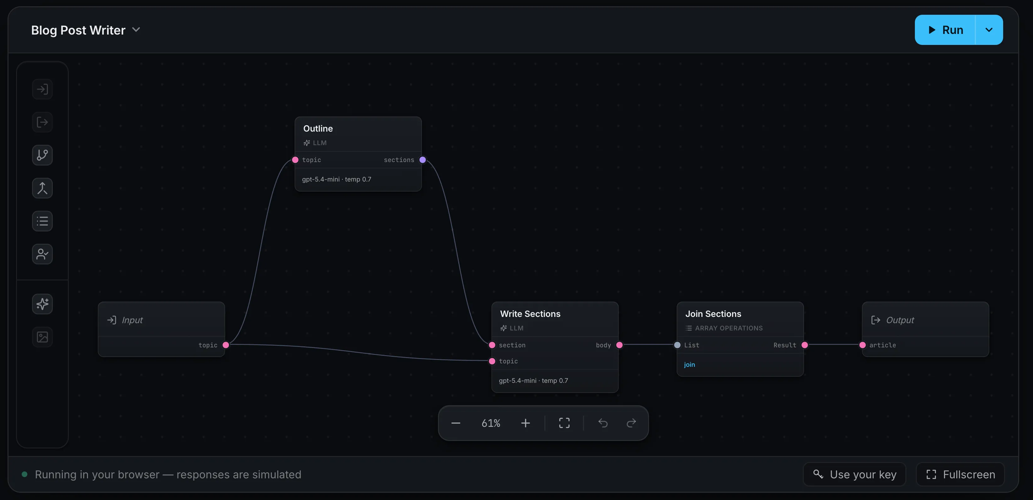
A read-only workflow wrapped in a minimal, embeddable shell. There’s no palette and no floating toolbar — zoom lives in a compact control in the header instead, and the config and result panels open as a drawer when you select a node rather than sitting in a permanent side panel. The result is something that drops cleanly into a page, not something that looks like an app.
createWorkflowEditor(element, { mode: 'preview' })This is the mode for showing a workflow off — an embed in your docs or landing page, a template gallery, a finished workflow a customer can run with their own data. The live editor at the top of our Introduction runs in preview mode.
Preview has a few extras you can turn on through the preview option, honored
only in this mode:
createWorkflowEditor(element, {
  mode: 'preview',
  preview: {
    themeToggle: true,
    keyButton: {
      onSubmit: (key) => {
        // store the visitor's API key and run with it
      },
      isActive: () => Boolean(loadKey()),
      activeLabel: 'Your key',
    },
  },
})themeToggleadds a light/dark switch to the header, so an embed can flip themes on its own without your page driving it.keyButtonadds a “bring your own key” button — handy for a public embed where each visitor runs the workflow with their own API key. ItsonSubmitreceives the key they enter. The button owns no storage, so tell it what state to show: returntruefromisActiveonce a key is saved and it takes on an accent style and swaps toactiveLabel, so a returning visitor can see their key is already set. It re-readsisActiveafter each submit.footercustomizes the caption strip along the bottom (or passfalseto hide it).zoomtoggles the header zoom control.
Running in any mode
Every mode can run a workflow — the Run button appears whenever you provide an
onRun handler, regardless of mode. What differs is how inputs are handled. In
edit mode, values you enter to test a run are saved back as the Input node’s
defaults, since you’re authoring. In read-only and preview, they’re collected
for that run only and never written into the workflow, because there’s nothing to
author.
How to actually run it
Wiring up onRun — in the browser or against your server — is covered in
Running workflows.
Where next
- Theming — match the editor’s colors to your brand
- Running workflows — give the Run button something to do
- Custom result rendering — control how a run’s output is displayed